The Trends page gives you two ways to compare event performance side by side: the graph and the compare table. Used together, they give you a complete picture of how your events stack up.
Comparing Events With the Graph
The graph lets you visualize performance over time and spot patterns as they emerge.
- Select a time period, or choose Custom to pick specific events to compare.
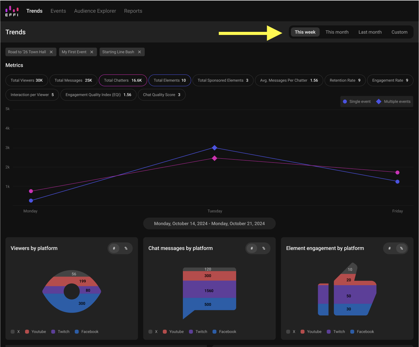
- Choose the metrics you want to focus on, like Total Chatters or Total Elements. The graph updates to reflect your selection across every event you've chosen.
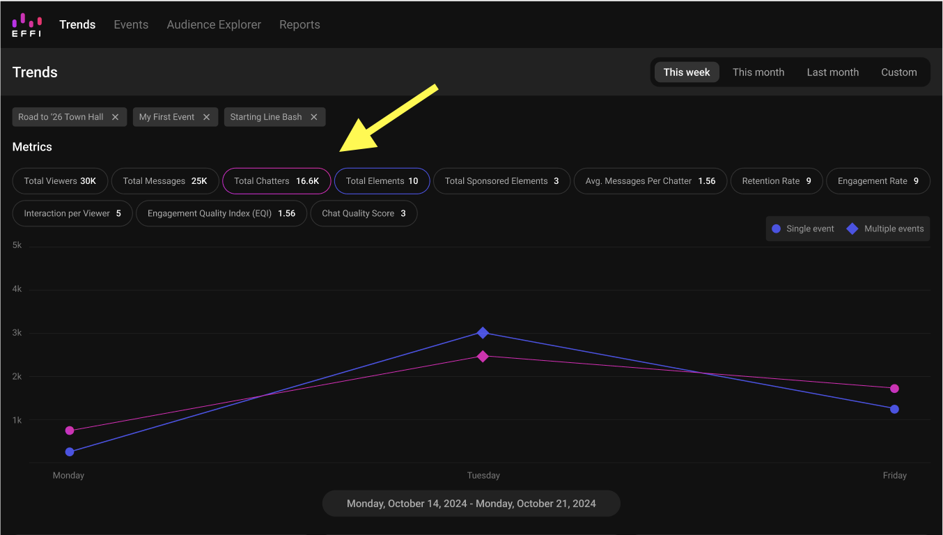
- Look at how each metric moves over time for each event. Spikes, dips, and steady patterns can point to what's driving performance.
Using the Compare Table
The compare table gives you the same events in a detailed, side by side breakdown. It updates automatically based on whatever you selected above, so there's no need to choose again.
- Scroll down to the "Comparative" section at the bottom of the Trends page.
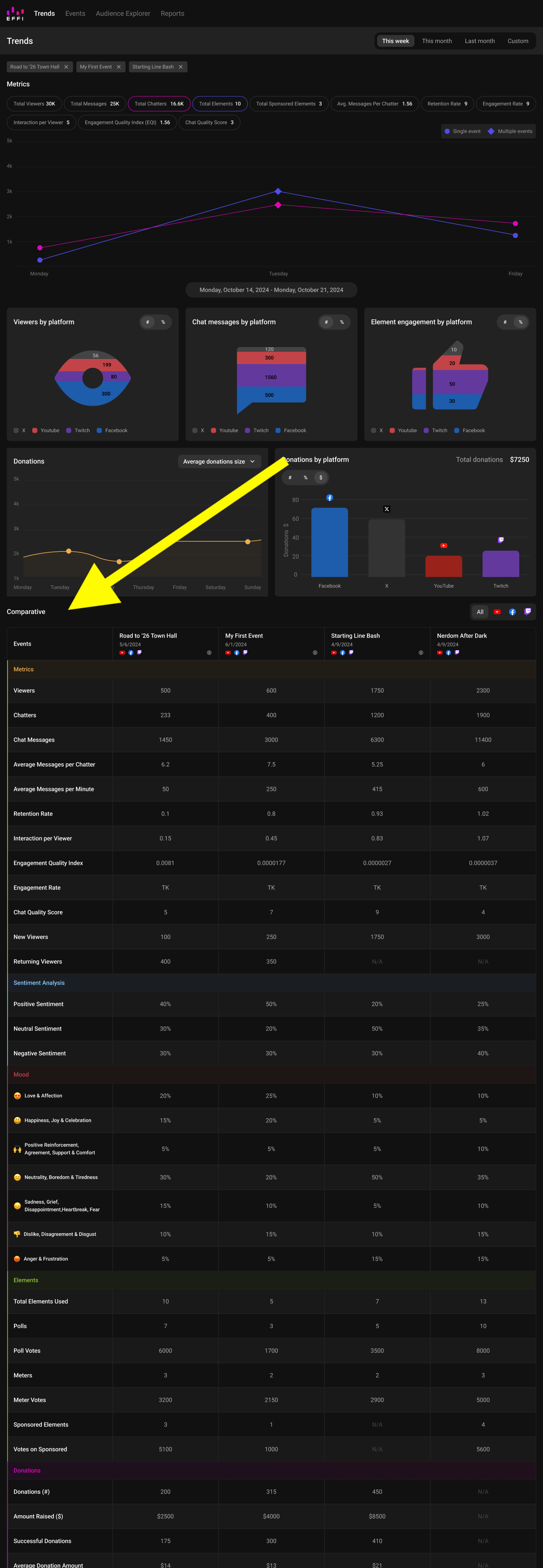
- Each event you selected appears in its own column, covering metrics like total viewers, retention rate, chat activity, sentiment, interactive elements like polls and meters, and donations if you use Streamocracy.
Tip: Use both tools together. The graph is great for spotting trends over time, while the table is better for comparing exact numbers side by side.
Was this article helpful?
That’s Great!
Thank you for your feedback
Sorry! We couldn't be helpful
Thank you for your feedback
Feedback sent
We appreciate your effort and will try to fix the article